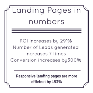
 Although landing pages are known to be invaluable tool for marketers, they are still underused. 44% of B2B campaigns link to home pages, instead of landings (Marketing Sherpa). But skillfully created landing pages can increase conversion by as much as 300%. In order to work so efficiently, they must fulfil 4 conditions: focus on particular aim (desired action), precise targeting, cohesiveness and responsive web design. A/B testing also proves beneficial. Below you will find our complete guide to creating landing pages.
What is a landing page?
Landing page is a dedicated page that persuades user to one, specific action (purchase, subscribing, participation in contest or event, downloading ebook, filling the form).
Shortly speaking: it communicates one definite proposition of value.
It’s not a home page or product page, but it’s designed especially for a given campaign.
Good landing page:
– shows an essence of a campaign
– promotes 1 particular action
– isn’t overloaded with content, mostly with little text
– is trustworthy
– is targeted precisely (e.g. to users who downloaded particular ebook, to people who read previous newsletter)
– is mobile-friendly
7 reasons why you need landing pages
- Higher conversion – even by 300% (Dell)
- More leads: companies that use a lot of dedicated landing pages (more than 30) generate 7 times more leads
- Supporting SEO
- Fast and easy for A/B testing
- Clear analytics: you see precisely where customers come from
- Higher ROI: even by 291% (Axway)
- Customer segmentation: content is adjusted to sources from which customer comes.
Elements of Landing Page
Each landing page should contain these 3 elements:
- Header: landing page focuses on one phrase which concentrates our communicate. In header you can either relate to customer’s feelings and general ideas or go for specific information and solid numbers. Whatever works to draw user’s attention.
- Arguments: why would someone do what we want him to? Give your customers some solid reasons, according both to your recipient group and type of demanded action. If you want them to purchase, present like Unique Selling Points, or opinions/ number of previous clients, or convenient delivery or warranty terms, or discount. On the other hand, if you want them to subscribe to your newsletter, let them know about content you send or special offers for subscribers. Simply offer ONLY arguments for that one specific action. Don’t recommend your product when you want customers to download an ebook.
- CTA: must be clear, understandable and SINGLE. Don’t put multiple CTAs on your landing page (e.g. one for purchase and one for subscription), because it will distract your users. They will have to choose, to decide, and that moment of hesitation could result in just abandoning the website. Use commonly known verb, as Buy (Buy Now)or Subscribe (Subscribe and Get your Discount).
Contrasting color helps make it visible.
Crucial rules of creating landing pages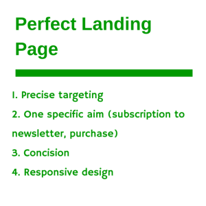
- Targeting is vital. The crux of landing pages is targeting – you know where exactly your visitors come from. Knowing that you can pick the most important information for that specific group. For example:
– Users who attended your webinar: You don’t have to explain basics for them, just refer to knowledge and benefits you presented and offer free trial. Nothing more is needed.
– Customers who purchases a product. You refer to the previous one and offer complementary service
– Former guests of you hotel, who visited it in summer: Offering them winter stay you don’t have to explain who you are – you just focus on evoking good memories from previous holidays and unique winter atmosphere (here a picture could tell more than thousand words).
- Concision. As you could see from above, suggested texts for landing pages must be short. Strive for and remove every information or element which doesn’t lead to demanded action.
Remember that concise doesn’t always mean short. Sometimes you need longer text (e.g. to explain to new customer how our product is better from competition), but it must be as concentrated as possible.
- Cohesiveness: landing page must correspond to rest of materials, to brand visuals and especially to creation of an ad. Pay attention to images – customers might not read all the copy, but they consume pictures. If they see any visual discrepancy (e.g. trekking boots on an ad, sandals on landing page) they will abandon the page, not read your copy.
- Minimalism: short, substantial and informative messages, bullets, suggestive icons, logo of previous clients, quotes. Remove everything that might distract from desired action (text, clickable elements, images).
- Aesthetics. Landing Page shouldn’t look cheap or ugly, because it won’t build trust. Avoid poor quality photos and rough fonts. Care about aesthetics as long as it supports function. Function – making customers do demanded action – is always primal.
- Responsive design. Most users read their emails o smartphones, Facebook is viewed more often on mobile devices than on desktop, so stakes are high that your landing page will be viewed on mobile devices. Responsive design improves its effectiveness by 153% (according to Ion Interactive). To make a fully responsive and mobile-friendly landing page you don’t need advanced or even basic technical knowledge. New easy and intuitive drag & drop landing page and newsletter creator in SALESmanago helps design beautiful, functional and fully responsive landing pages for all your campaigns.
- A/B Testing. As mentioned above, landing pages are excellent material for A/B testing and checking new means of communication. Maybe your users will love video? According to Eyeview use of video on landing page can improve conversion by 86%. test it on ypur landing page!
- Marketing Automation. Let’s go back to our first, crucial rule: efficiency of landing pages depend on precise targeting, which can be achieved at large scale only with Marketing Automation tools,
As you can see, benefits from use of landing pages are massive. Not when it’ s so easy to create a responsive landing page – thanks to our new creator – it doesn;t require either technical knowledge or IT resources.
 Follow

