 Your user spends less than 8 seconds on your landing page. That’s just a blink of an eye: how can you use that moment best to seduce him? We apply some customer psychology principles to find out how to build successful landing pages, which will convert like crazy! Start with setting one single aim of your LP.
1. Define one purpose
The point of landing page is that it serves one and only one purpose: filling out the form, downloading ebook, buying an item, signing up for newsletter or free trial. It focuses on single action you want users to do and doesn’t distract them with other options. Therefore be precise in crafting your CTA. Use contrasting colors and blank spaces to emphasise it.
Discover the truth about your customers!
Download free ebook and create professional Buyer Persona.
Why: People are overwhelmed with data today. As David Rock writes, now The New York Times on Sunday contains more information than the average 18th century French Nobleman learned in his lifetime. Each moment of attention consumes our energy: glucose and other metabolic resources. Focus is expensive, hence we easily get distracted.
That’s why, knowing the environment you consumers live in, you must make decision making as easy for them as possible. Don’t make them choose. Don’t make them deliberate. Just reduce your message to one simple: “Do it”.
2. Build arguments
If you want customer do something, you must also provide solid reasons. What are the benefits? Why to buy/ subscribe/ fill? Your landing page must address these questions, because otherwise your request will sound illegitimate.
What works best:
- Numbers and statistics: don’t write essays about how your product will change somebody’s life. Showing it in numbers will be more compelling and easier to digest.
- Customers opinions, ratings, testimonials, success stories: present evidence that your solution works.
- References to customer’s particular situation: don’t be vague. No product is “best”, “leading” or “optimal”. You are talking to a specific audience, so respond to their needs.
- Short table comparing your solution to competition, showing your advantages: it will make you look like a real leader, as you are not afraid of comparison.
- Use the word “Because”: it implies justification, which is a powerful psychological tool.
Why: our brains are justification junkies. We want to appear logical to ourselves, so we need an impression that our actions have solid reasons. In famous copy machine study from 1977, researchers from Ellen Langer team were trying to cut the person in line to copy machine. They tried 3 versions of asking a favor:
a) Request only: “Excuse me, I have 5 pages. May I use the Xerox machine?”
b) Request with a real reason: “Excuse me, I have 5 pages. May I use the xerox machine, because I’m in a rush?”
c) Request with a fake reason: “Excuse me, I have 5 pages. May I use the xerox machine, because I have to make copies?”
Interestingly, versions (b) and (c) were almost exactly as successful (94% and 93%), even though version (b) doesn’t make any sense whatsoever.
The study discovered that the word “because” drives our behaviour. As long as we can justify action (“I’m doing it because…”), it seems legitimate. The reason itself is secondary.
3. Remove the risk
Provide a guarantee to reduce risk. Provide preview of an ebook you want user to download or video presenting the product or service. If asking for personal data, let know how will you use them (e.g. how often do you send newsletter and what’s in it, if asking for subscription). Also keep the look of your primary website, so customers feel familiar recognizing your brand.
Why: Making each decision, no matter how small, entails a risk. Even if consequences are small, we still would prefer to feel safe. Use that need when creating a landing page and make sure that you can give your user sense of security.
4. Make it readable in less than 8 seconds
Sorry to disappoint you, but your customers won’t read big amount of text. They’re used to consuming small chunks of information and easily get distracted and bored and concentrate on one message for 8 seconds.
Therefore the best option is to be concise, don’t waffle, and declutter. Use bullets, tables and images instead of full sentences or paragraphs. You can consider video, as it increases conversion by 80% due to being easy to consume. When designing a contact form on your landing page, cut down the amount of fields to minimum. Reducing the number of fields only form 4 to 3 improved conversion rates by half, so really think about what information is essential (and you will actually use it in the future).
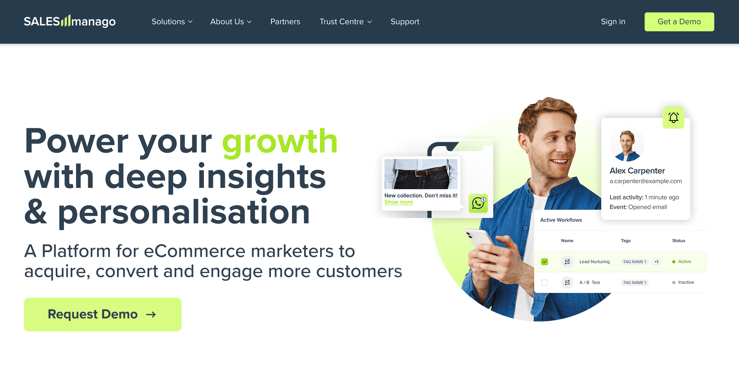
It also applies to images: you might be tempted to include too many over-the-top images, but it might distract users and increase the load time of the page. Obviously, you have to optimize it for mobile devices, what marketers often forget about. If your emails are responsive, that’s great, but far from enough! Also your landing pages must be mobile friendly. You will build them quickly even without technical knowledge with SALESmanago drag&drop creator.
Why: Customer attention span today is less than 8 seconds: for such time readers can focus on your message. If you fail to inform them what do you want them to do and why (how they will benefit from doing so), you probably won’t have opportunity to do it at all.
5. Run A/B Testing
A/B testing are the best optimization tool, which also helps you get to know your customers and shape your website according to their preferences. No wonder that it’s used by the biggest players in the field, like Google or Amazon.
Why: Don’t you ever get blinded by general rules and common sense. “Everybody does it” in never a good reason. That’s why you really should try to test your landing pages as often as possible to ensure that they resonate with your specific audience.
Consumer psychology tells us that when creating landing pages we must focus on brevity and offering one, single option, reducing amount of decisions and choices they need to make. As we know that users have short attention span, we must concentrate our arguments in such a short and easy to consume content that it can be read in less than 8 seconds.
Good Marketing Automation software also helps in creating the website itself as well as in discovering your customers needs.
 Follow

