 We’d like to apologize to all those, who liked the old interface. We’d like to thank those who used to moan and lament but stayed with us and we promise it’s not our last word on the matter. And those who would like to contract for SALESmanago just because it looks so good – be warned, the system is still as advanced and sophisticated as it used to be and it takes some time and skills to bite into it. However, with this UI transition, we launch the strategy to enhance and simplify our system service.
Last year we didn’t bum around and waste time in the field of creating new SALESmanago functionalities. We introduced and implemented over 70 new processes and many more improvements enhancing the system usability. Among others, there are some gems like conversion analytics from e-mail messages, integration with FB Custom Audiences and RTB, dynamic banners on WWW page or e-mailing day and hour automatic tailoring to particular person activity.
At the end of the year we did prepare something cool for you. We introduce the new UI and we smoothly tweak the arrangement of content in the system:
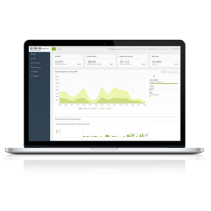
- new dashboard with new statistics
- system menu accommodated on the left
- brushed up and clearer graphs
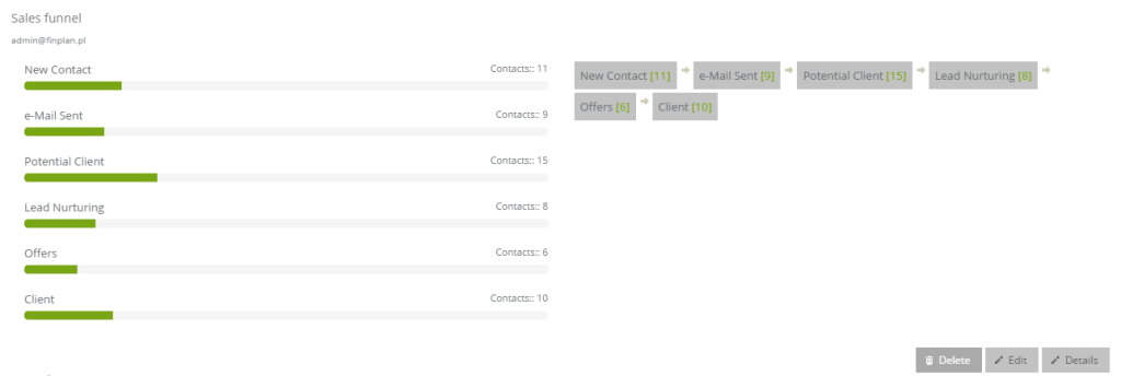
- new visualization for sales and marketing funnels in campaigns
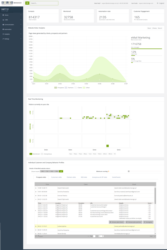
New dashboard for SALESmanago Marketing Automation system
Now, on homepage there are information about:
- the number of contacts in the base and its changes
- the number of monitored contacts
- the number of activated automation rules
- customer engagement – number of page views/monitored contacts
- the number of sent, opened and clicked e-mail messages in particular time
Real Time Visit Monitoring Module was subject to a few changes. The circles or ‘bubbles’ disappeared in favor of squares. This way it’s easier to arrange and browse visitors in time periods and in relation to scoring figures.
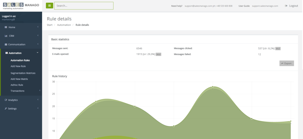
System menu accommodated on the left side
Yes, now the menu is located on the left hand side. Fortunately, nothing more was changed so the arrangement is similar but now in vertical setup. Good news for those already taking advantage of SALESmanago.
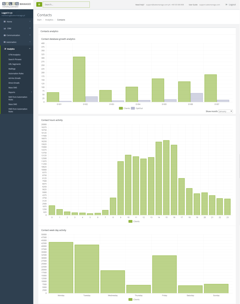
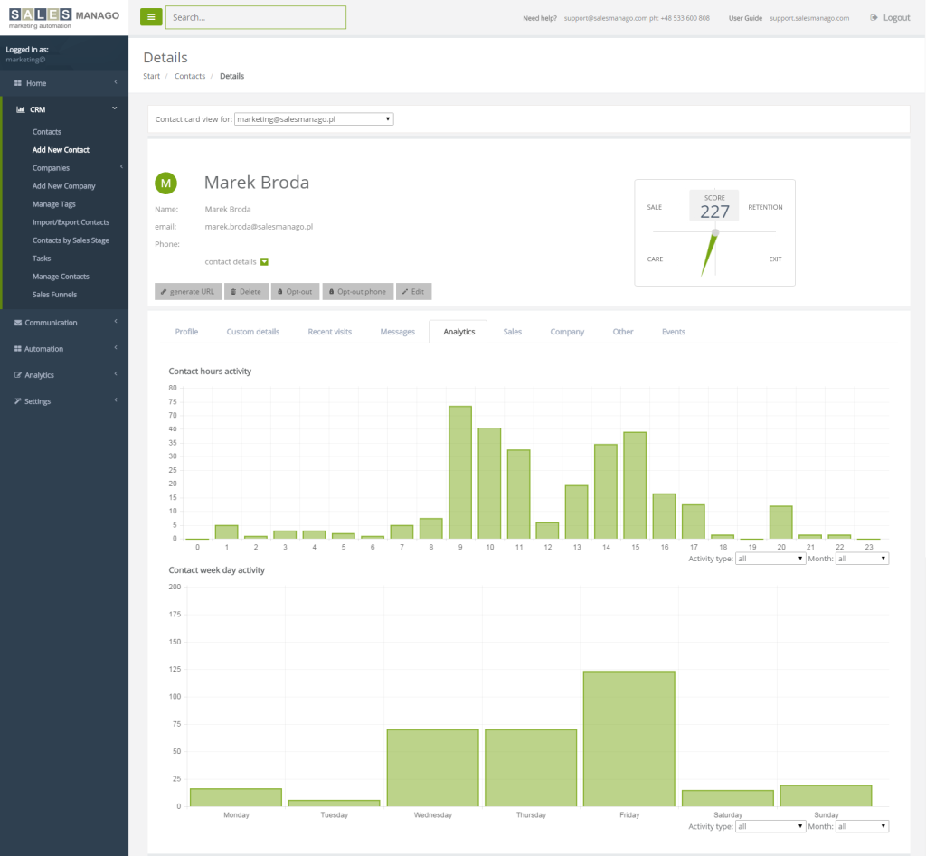
Nice and clear graphs in Contact Analytics for the whole base and individual contacts
All the graphs in the system got a new look. First of all, they are more user and eye friendly. Look at the example in ‘Contact Analytics’ below:
and in the Contact Card in CRM:
The funnel is dead, long live the funnel!
The classic look of a funnel, which was with us since the system initial launch, disappeared once and for all. It was replaced with much more stylish visualization, with exactly the same functionality:
Summary
New interface of Marketing Automation SALESmanago is another change in a spirit of building new, state-of-art and user friendly system. We are looking forward to hear your opinions and comments on the new UI. Feel free to join the discussion.
Would you like to see new UI and get acquainted with SALESmanago? Log in HERE for the demo version or HERE to begin 30 day test period.
 Follow

