In order to radically enhance your experience with our system, we redesigned its interface from the ground up. To start, we prepared pioneer Human Interface guidelines, inspired by the latest design trends for the most intuitive operational systems. Accurate execution of the design principles led us to elevate User Experience to the level till this day unreachable by any SaaS software.
The goal we set for ourselves was to remove every obstacle between the human intention and the system action to create and evoke a perfect flow. We reached a remarkable 60% increase in speed of operations and reduced the clicks by 33%.
In this article, we summarize all the changes and explain our inspirations. Enjoy!
User-driven revolution in SaaS – Human Interface
The constant development of end-to-end platforms demands a new approach to design principles. We already made the most out of the classic SaaS interface. To deliver a truly revolutionary, user-driven experience, we decided to:
- Design the interface from the ground up instead of developing the existing one.
- Completely discard the classic SaaS design philosophy which we see as insufficient for modern CDP.
- Seek inspiration in the most intuitive and seamless interfaces, even for non-professionals – operational systems like Windows or macOS.
In consequence, we achieved the effects unparalleled in SaaS programs:
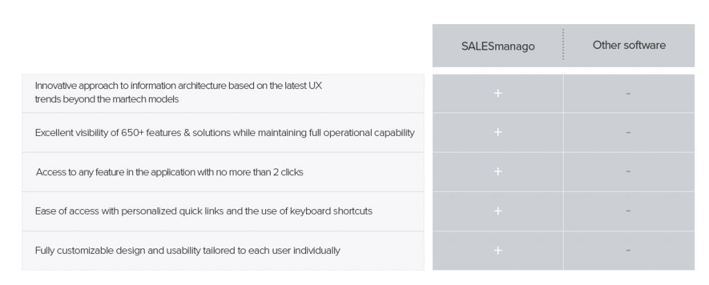
- Speed. Because fewer operations are needed to get to the desired feature, the new menu allows you to navigate through the system up to 60% faster, more intuitively, and with ⅓ fewer clicks,
- Seamlessness. Users who know operational systems from their daily routines will recognize the design immediately and will know how to navigate it.
- Personalization. As in the case of the operational systems, users now can customize the interface according to their needs.
- Agility. There are now many ways to get to any of SALESmanago’s 650+ features & solutions, according to the user’s preferences and customs.
We designed a navigation system so friendly, seamless and fast, that we named it simply Human Interface.
Menu Anatomy
Intuitive navigation and hotkeys
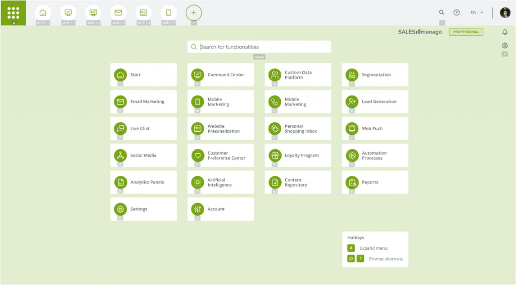
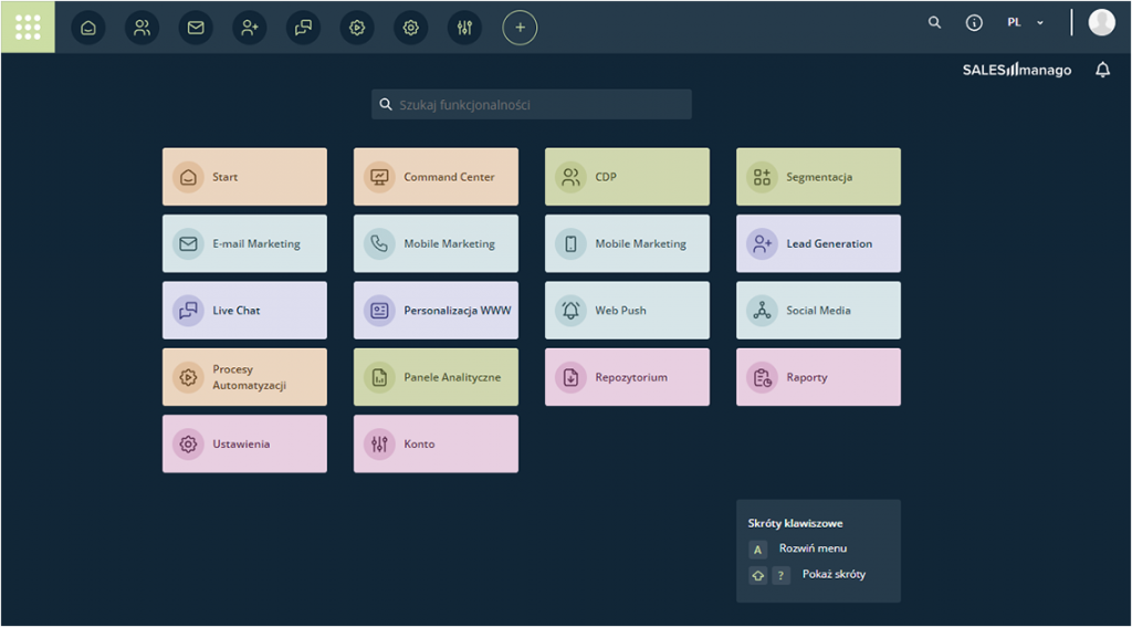
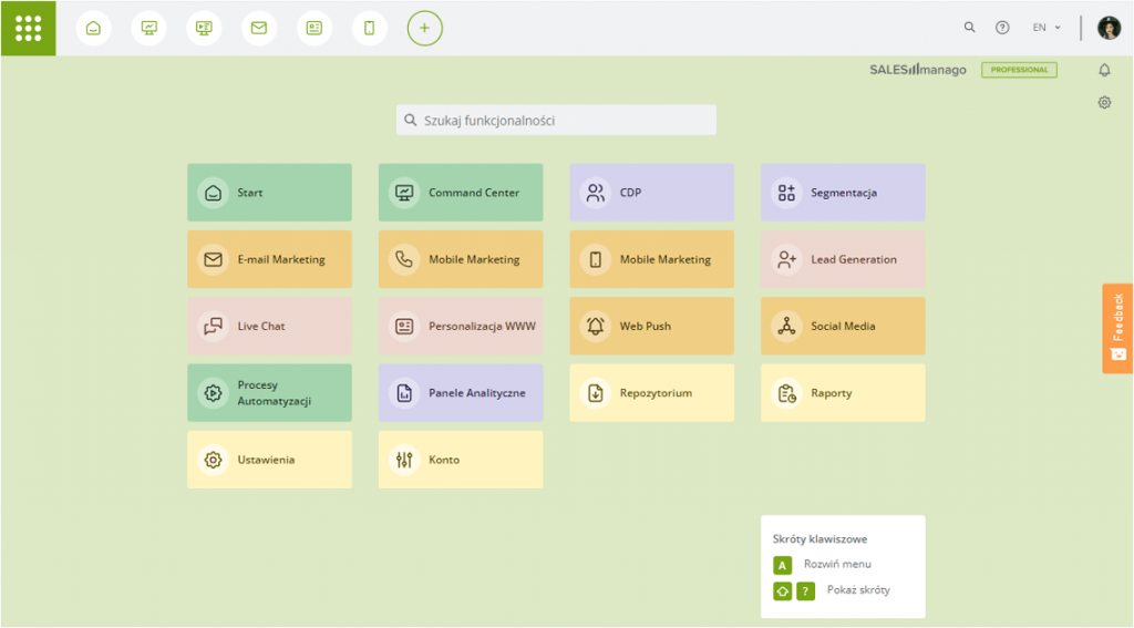
New menu is now easily accessible with a large, green button in the left upper corner of the screen. You can also use A hotkey to access the menu (more on shortcuts later).
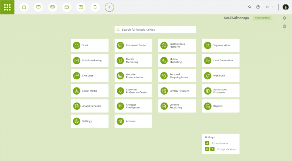
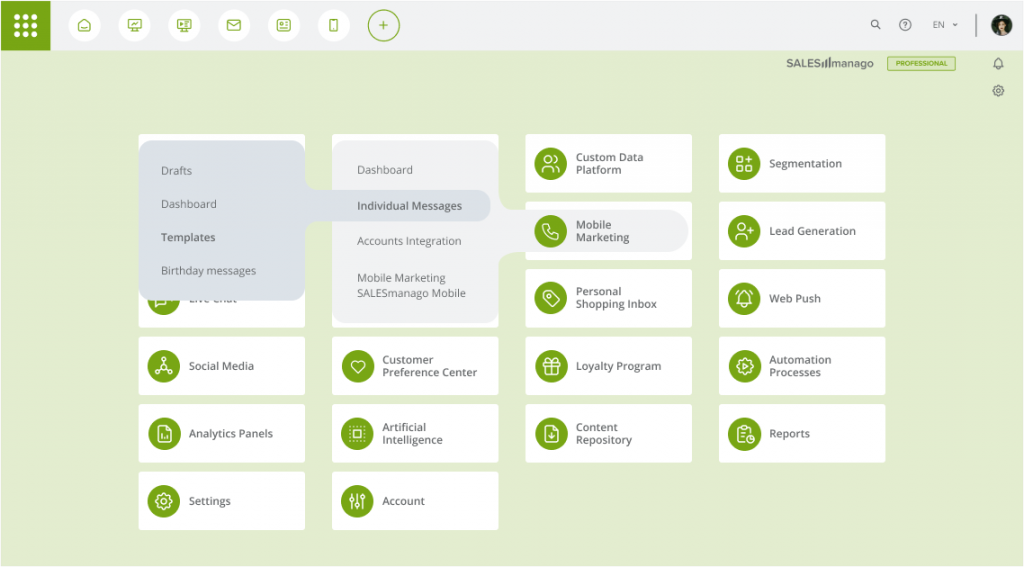
Navigation in the menu is now a breeze. Just hover the cursor over the chosen position, and the whole feature tree will appear. You can go straight to the needed functionality with just one click, even if it is located on the secondary list in the menu!
Another innovation is the introduction of hotkeys, which further improve the navigation within the application. Use Shift+? to highlight all available shortcuts.
Favourite features at Your fingertips
Quick links are a set of most frequently used features accessible instantly from the top bar. They allow you to jump to selected feature from any place in the system with one click. You can fully customize the set, the order of links, and the icons’ look to suit your needs.

To set up your own array of Quick Links click on the Manage button.

Then, choose a desired feature from the drop-down menu. As a Quick Link, you can select any feature, and then customize its icon. Then click the Save button on the Quick Link bar. Your new link has been added to the bar.
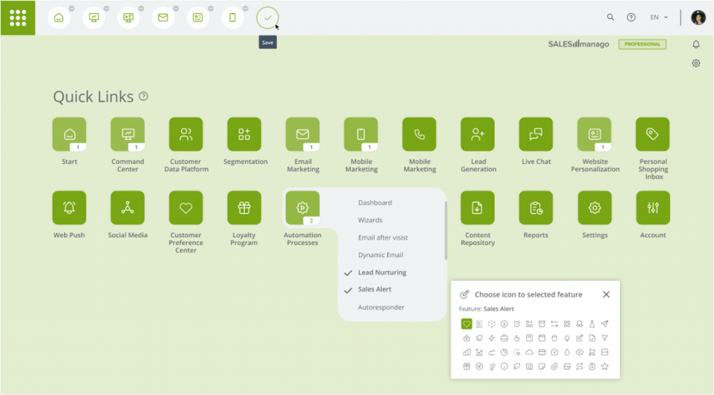
You can pick up to 15 Quick Links. To delete existing items, click the minus icon next to the selected Quick Link.
Contextual menus
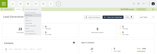
Contextual menus, or breadcrumbs, display located horizontally below the top bar with quick links. This is a permanently visible support menu that allows you to smoothly move between features of each module. They change dynamically according to your location in the system to reflect the structure of features in each module.
Your workplace, your colors
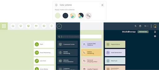
Adjust the color of each item in the menu according to your taste. Change the colors of fonts, icons, tiles, and backgrounds at will. You can change colors for groups of elements (i.e. all tiles, all icons) as well as individual items on tiles (different icon color or background color on a selected tile).
Zero click human-system communication
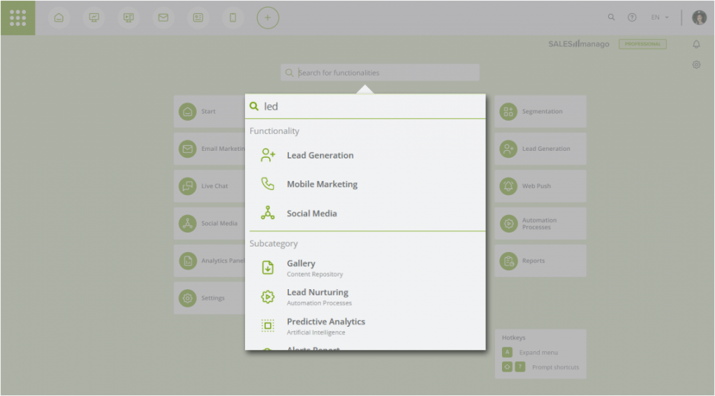
The new menu contains two search boxes. The first search box is located in the menu. It allows you to quickly find all necessary features and their subsections.
This way the experienced users, knowing what they are looking for, are now able to get straight to the desired feature from any place in the system. No clicks at all.
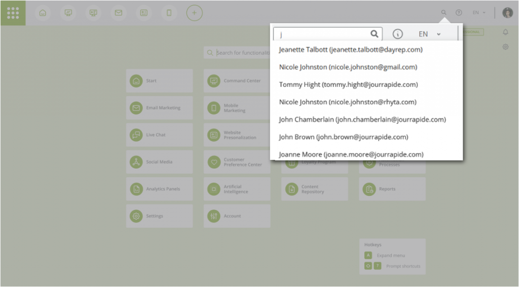
The second search box is located in the top bar. It allows you to quickly find a contact in your Contacts list.
Summarizing new, friendly ecosystem for operations
- Re-shape your CDP & Marketing Automation experience with a redesigned menu navigation and an innovative approach to information architecture that provides quick access to all 650+ features & solutions
- Save time thanks to simplified navigation inside the application: reduced by 1/3 the number of clicks and time cut by 60% to reach all system features
- Benefit from a number of improvements, based on the latest usability trends, that will grant you fast and seamless navigation through the system
- Compose your own list of quick links, so you can access the most frequently used features directly from any place within the application, without opening the main menu
- Use customizable hotkeys to smoothly access your favorite features in a split second
- Enjoy bespoke user experience by fully tailoring the design and quick links selection to your needs so you can access the most important and frequently used features in no time
Standard CDPs navigation and SALESmanago CDP’s new Human Interface
 Follow

