Personalized pop-ups are a good way to attract new customers and an important part of your marketing plan. Did you know that you can increase pop-up conversion by 84% by adding graphics and achieve 206% higher efficiency by reducing the number of form fields? Find out what else you should pay attention to in order to avoid pop-up traps and effectively turn anonymous users visiting your website into actual customers.
Take care of the visitor’s first impression
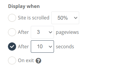
An important aspect of pop-ups is choosing the right moment to display them. Popping additional windows on the home page at the first visit of the user not always leads to success and will rarely cause leaving the contact details. Most customers, when entering a new website, want to get to know it first and only then decide whether they want to join the group of subscribers to the company’s newsletter. When creating a pop-up message, it is important to be able to define the situation in which it should be displayed.
In SALESmanago, you can set display parameters such as the number of page views and visits, after which the pop-up is to be displayed, the percentage of page scrolling, and also you can set the window to appear when the visitor tries to leave the page (exit pop-up). Additionally, you can control on which URLs it is possible to display windows and on which it is blocked.
But what solutions are the most effective? Statistics show that the average pop-up conversion is 3,09%. The biggest increase in this context is provided by windows displayed eight seconds after entering the website, increasing the effectiveness to 3,62%. According to Sleeknote, we can also improve conversion by defining the right display moment for page scrolling. Set the popup to pop up after viewing 35% of the page to increase conversion by up to 3,35%.
Set the proper frequency of displays
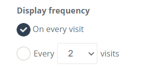
Excessive display frequency of pop-ups is one of the key reasons why potential buyers decide to leave the page (only 8% of pop-ups with the highest conversion appear on the page in less than 4 seconds). A customer “attacked” with constantly popping up advertising windows may feel irritated and leave the website to check the competition’s offer. Make sure that pop-ups are not displayed too often. In SALESmanago you can control the display of messages based on the number of customer visits to your website – decide whether to show the pop-up every time or more sporadically. Combine the Display moment with Display frequency to better manage the behaviour of your pop-ups so that they don’t overwhelm your visitors.
Remember about mobile users
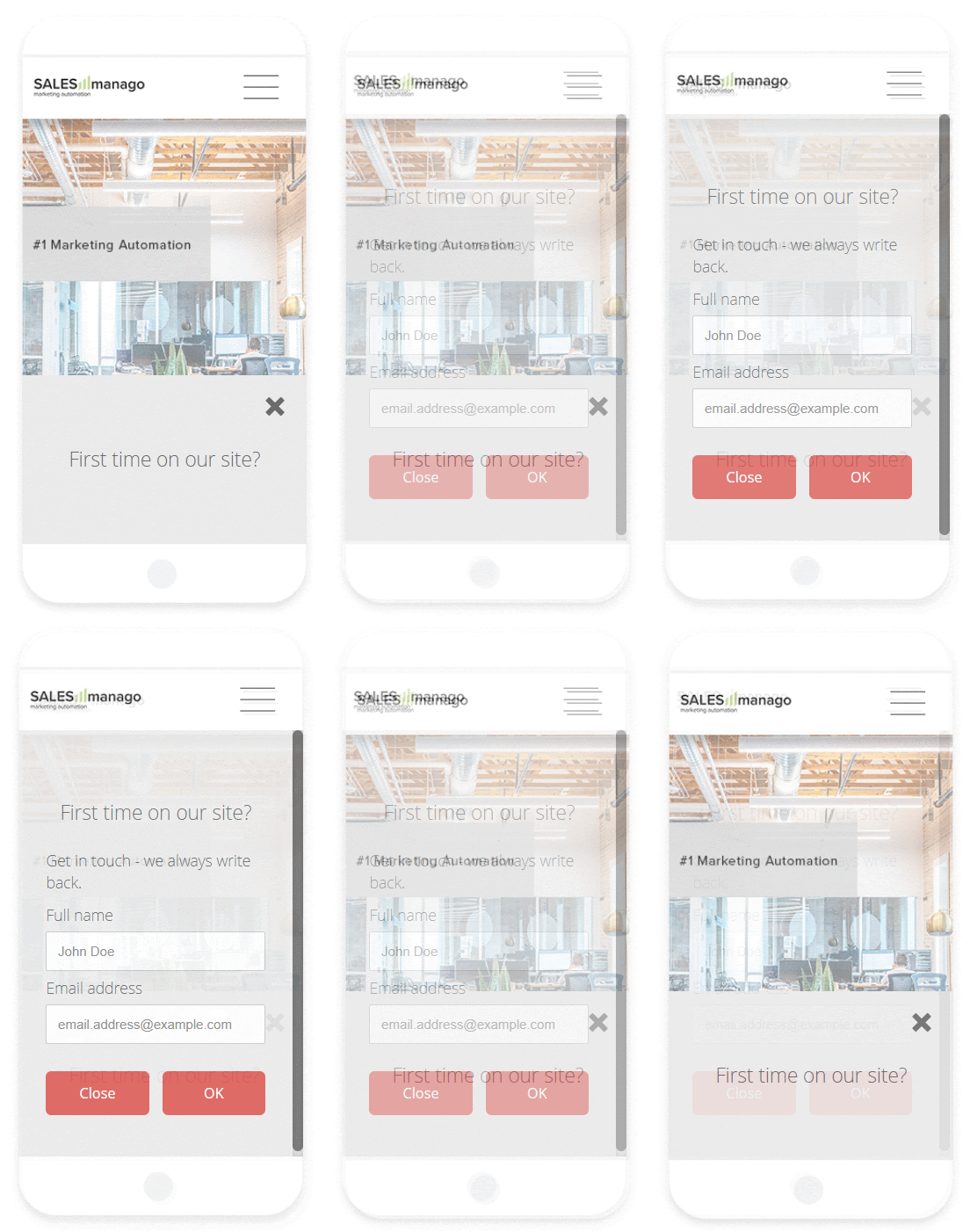
According to data from Statista, by 2021 mobile shopping will cover as much as 72.9% of the eCommerce market. To meet the expectations of your customers, adjust the way the pop-up is displayed on mobile devices. You can do this regardless of the settings assigned to the desktop display. Choose the size of the window, button, and even the shape, size, and location of the closing image. It is worth choosing these settings properly because research shows that pop-ups displayed in the center of the screen are the least enjoyable for customers and cause negative or very negative feelings for as many as 95% of mobile device users. On the other hand, the lack of a clearly visible closing button was ranked high fourth in this ranking (93%).
The pop-up itself must be easy to use, and the message should not cover the entire page and make it impossible to read.
Increase the conversion with images
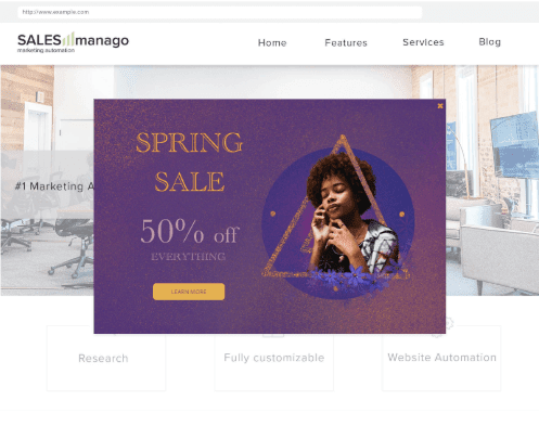
The conclusion about adding images to pop-ups is very simple – do it.The analyzes show that graphical content has a positive effect. Conversion of pop-ups with images 3,8% as opposed to the 2,07% effectiveness of mostly text-based pop-ups. This means that just adding graphics can bring you 83.57% growth!
Make sure you use the correct number of fields in the form
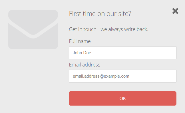
It turns out that the number of fields is of great importance. Sleeknote research shows that pop-ups with two fields are the most effective (3,31%), which turns out to be a slightly better solution than those with one field (3,2%). Increasing their number drastically reduces the conversion – pop-ups with three fields are effective only in 1,08%. Think about what information in your form is really crucial and try to limit the amount of it. In the beginning, it is worth requiring only the basics, i.e. e-mail address and first and last name or telephone number. Remember that you can collect other data later, for example during a LiveChat conversation using the progressive profiling function. However, if you really need more information immediately, you can include more places in the form.
Adapt Call to Action to the customer and apply appropriate Lead Magnets
Thanks to the ability to track user activity on the website, SALESmanago allows you to schedule the display of a given pop-up when the customer behaves in a certain way. Thanks to the Website Automation function, you can choose which of the previously prepared pop-ups with different CTA variants will be displayed to better adapt the content of the message to what we have already learned about the user.
However, you must remember the basic principles of effective CTAs. They are:
- direct (use the 1st person singular form, according to statistics, such an action can increase the number of clicks by up to 90%),
- conspicuous (with contrasting colors or a visible border of the button, and the larger CTA font size emphasizing the text, suggesting a hyperlink),
- precise (the user should know what will happen before clicking)
At the same time, take into account that the use and application of Lead Magnets in Lead Generation, i.e. all kinds of incentives that the customer receives in return for providing data, can increase the number of your contacts with opt-in status by up to 85%. The most commonly used Lead Magnets are discount codes, free e-books, reports, and freebies. If you are not convinced of offering discount coupons in exchange for an email address, you can introduce some restrictions. For example – the coupon is only valid for the first order, above the specified amount, or can only be used on the second order. This way you will encourage new customers to buy again.
marketing automation
marketing automation
 Follow

