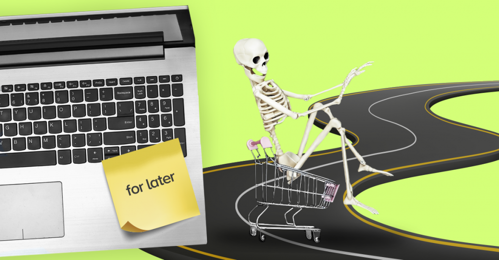
 The sobering-up effect is widely known to psychologists, who use that name to describe a moment of plummeting enthusiasm. Do you remember that feeling when you engage in something and full of energy, but after a while you realize that it’s not all so rosy as you imagined? You start to see problems, obstacles, and drawbacks.
Skeptical phase comes naturally after hyperexcitation. But what does it have to do with e-commerce? Quite a lot. Recognizing the process will help you optimize your check-out procedure.
Develop a professional Buyer Persona. Download free ebook
Sobering-up effect in e-commerce
The sobering-up effect happens when it comes to payment: we look at the products we put in our cart and begin to wonder whether you need all that. Maybe it was just a whim? Maybe you can do without? Items we were so passionate about three minutes ago, now seem just banal and uninteresting.
It happens as an inevitable part of the shopping process, as consumers today lose interest quickly. Hence, there is no way to avoid it; you must prepare for such moments. Namely, you must optimize your check-out procedure so its sobering-proof.
Check-out optimization
1. As little steps as possible. Each additional decision or field to fill in pushes user away from completing a transaction and gives her more time to changer her mind. That’s why your check-out procedure should be short, intuitive as short. You can try single page checkout, where you fill all the data on one page and accept it with one button. Enable purchase without registration, because there is nothing more frustrating that having to go back to sign up and then do the whole procedure once again. Customer can always do it after purchase, so no need to distract her right now, where she focus on finishing the deal.
2. Print your order. Sometimes people like to consult others, or they don’t make a shopping decision on their own. Allow them to print the contents of their cart.
3. Suggest complimentary products. With Marketing Automation, you can offer a complimentary product. The aim here is not only to encourage a customer to buy more but also to show that you know her preferences well, so she is good hands.
4. Don’t distract. In your shopping cart, you should avoid any distractions that might make your user abandon the procedure. Be concise and ensure that “I pay” is the most visible part of the website.
5. Sense of security. The best way to respond to shopper’s doubts is to guarantee the possibility of returning purchased items, what reduces the risk involved in buying. Also make logos of payment operators visible.
6. Remember contents of the shopping cart. Make sure that even if a user abandons the website rapidly, contents of her cart stay there, so when she comes back, they wait for just one click. Also, consider implementing wish list, which helps people with long decision process to make their mind and go back to you when they’re ready.
7. You saved X. Everybody loves to learn that they saved some money. That way buying almost doesn’t sound like spending. Remind your customer once again that she makes a good deal to avoid the sobering-up effect.
8. Be direct. At each step tell user directly what to do next.
9. Abandoned cart rescue. When shopping process is interrupted, nothing is lost (yet), but you must get active. Use abandoned cart rescue emails! They’re amazingly efficient. According to our clients’ data, such emails show 621% higher conversion when compared to traditional batch emails.
10. After-sale support. When you aim for lasting relationship, not just one isolated purchase, after-sale support is the way to show your customer how much do you care about his satisfaction. In the message following the buy, include tips on using the product and email or phone number if a customer had any questions. Such message also provides an excellent opportunity to ask for a product review.
When planning your shopping process, take into consideration moment of enthusiasm decreasing. You can handle customers’ skepticism with intuitive check-out procedure, abandoned shopping cart rescue messages and thoughtful after-sale support.
 Follow

