 Are you thrilled by Wikipedia’s beauty? Bo you feel compelled by esthetic appeal of eBay? Exactly. Visual attractiveness of a website is not so important as it may seem. So before you plan another redesign and optimization, read our text and learn why users don’t search for breathtaking look, but functionality, and feel more comfortable on not so pretty pages and more willingly buy there.
What is ugly website?
- Archaic solutions. Ugliness in a question of fashion: something what used to be so chic 3 years ago now seems repulsive to us
- Aesthetic incongruence (e.g. fonts, graphics)
- Low-quality photos
- Cheesy graphic
- Too many colors, lack of one defined palette
Ugliness doesn’t equal lack of functionality. Both pretty and awful pages sin against clarity and intuition. However…
Functionality
Unattractive website often focus on one given aim (and sacrifice esthetics for it), so appear far more functional. According to Stanford Technology Persuasion Lab, 41,6% of consumers find that quality crucial and denoting company’s credibility.
Paradoxically esthetics complicates UX. When beauty becomes more important than function, you offer your user a rather unpleasant experience, e .g. you try to make all the subpages consistent, so you add visual elements without any pragmatic role.
Ugly website makes user feel secure
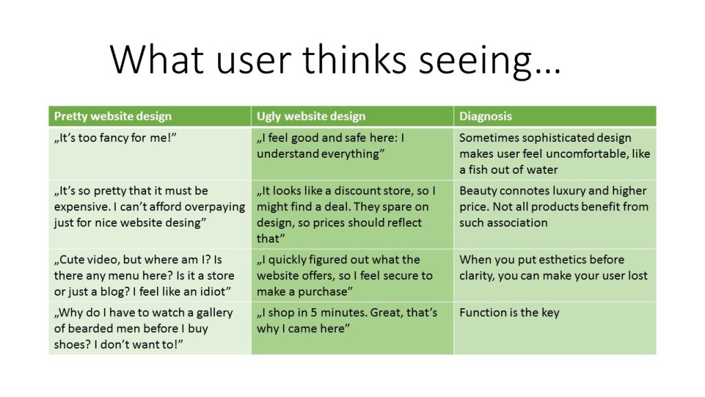
Why? Because s/he can understand everything. Ugly often equals old, outdated, but it means that users are used to such solutions and find them intuitive and easy to navigate.
Trust
When you feel secure on the website and easily find what you look for, you trust it. As you have sense of control, you can place confidence in someone behind it. According to KISSmetrics experts, ugly website says: ‘Hey, we’re just like you, we resemble the store over the corner where you usually shop!”
Expecting lower prices
Exclusive shop with so-called designer products which you can buy twice as cheaper around the block. Too beautiful webpage is perceived as online equivalent of such fancy store. User suspects that something is wrong and money spent on store design will be included in the markup.
Too fancy for me!
Overly sophisticated or novel solutions might intimidate user, s/ he feels not modern enough, not smart enough, frustrated and alienated. Such experience decreases probability of making a purchase, and builds unwanted linkage between negative emotions and the brand. Nobody likes to feel stupid! In other words, it’s better if user thinks : “That website isn’t too pretty” than “I’m an idiot”.
Still considering redesign? Remember!
- Simplicity is crucial. Know what user should do on your website (read, buy, register….) and remove all distractions, even if it makes it less appealing
- Function over beauty.
- You design for customer. Make him feel comfortable.
- Test. They are some ugly solutions that sell well, as 3D CTA button in newsletter. It looks bad, but don’t judge it until you test how it works.
- Know your customers. Having demographic and behavioral data you know how they navigate and what do they search for. Use Marketing Automation and personalize content.
- If it ain’t broken, don’t fix it! Each redesign poses a risk and your users get used to your website. Don’t change it if it’s not necessary, says Neil Patel .
It’s the customer who should feel good
Gorgeous, lavish websites make their creators feel good: artistic, sophisticated and unique. But in such stores most customers simply feel lost: why does the tag cloud spins to the rhythm of Mahler? Where is menu? Is that all irony? What am I doing here?
On less modern and pretty pages customers are more secure. Not so up-to-date solutions might not be beautiful, but are familiar. Possibility of efficient navigation and finding easily searched items gives sense of control, what leads to purchase.
That’w why in eCommerce artistry is not always an asset – it can turn into a threat if you put esthetics before function.
Read more on marketing myths
Luxury customer service – myths busted
Do marketing cliches work?
Should you be scared of Marketing Automation?
Is website esthetics important to you? How do you feel about it as a marketer and as an user?
 Follow

