Conversion is a transaction when you look at it. First, you have to grab website visitors’ attention, then tell them your offer, name the price, and finally push them gently towards the ‘purchase’. Even though multiple tools could work well this scenario, pop-ups are still one of the most effective.

I don’t want to bore you with tons of stats just to prove my point. You can find this information yourself if you want to, either on the internet or this blog. For now, the only thing you should be aware of is that while the average conversion rate for pop-ups is 3.09%, for the top 10% best-performing pop-ups this number goes up to strong 9.28% (Source). I’d call it a tactic worth trying.
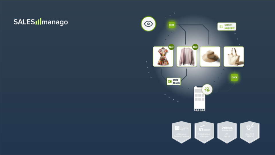
Pop-ups come in different shapes and sizes. There are:
- dynamic pop-ups
- welcome mats
- sidebars
- exit pop-ups
- and so on.
Any decent marketer could invent at least ten ideas on how to use these by now. But wait, there’s more. Pop-ups can be triggered by a number of user actions, such as:
- visiting a website
- visiting a particular URL address
- being on a website for a specified period (for example 45 seconds)
- scrolling through a x% of the website’s length
- performing an action
- browsing a specific product category
- browsing a specific amount of subpages
- navigating away from the page
…and many more.
The anatomy of a pop-up
Every pop-up has some mandatory elements, as well as some extras you can add. The most obvious and necessary elements are a title and call to action. It’s their job to grab a visitor’s attention and push the sale opportunity forward. Also, if a pop-up is designed to generate leads, it should include a contact form to let people leave their details. Other typical elements are body text, visuals, and a negative CTA.
Title
The very heart of every pop-up is its title. A larger font catches the eye – quite literally. Our eyeballs instinctively focus on the most visible part of the design, according to this website eye-tracking study. I’d say it’s an opportunity you can use. If you write a killer title, a headline with a promise so bold, that a visitor simply won’t be able to ignore it, this will not only make people want to read what comes next but also intrigue them enough to follow the call to action.
There are several approaches to preparing good headline copy. The first one is to write a plain, straightforward, direct headline. It’s simple but effective. Just highlight the key benefit of your offer: “Free shipping”, “Midseason sale, 50% off”, “Get your free ebook now””. See what I mean? A direct message can be powerful – if you get straight to the point, the user doesn’t have to guess what you meant. It’s pure meaning. It can also help you segment your audience, improving the quality of obtained leads.
Another good way of writing a headline is to phrase it as a question. Titles starting with “Ever wonder how…” or “Do you want…” are a safe bet. We tend to answer automatically any questions we encounter. It’s how our brains work. So asking Putting a question where it is visible is an effective way of engaging viewers.
When it comes to exit pop-ups, direct commands are the way to go. Imagine this: someone read your blog for a while, browsed for some cool socks in your online store, or checked the ticket prices for the event you’re hosting next month. And now they attempt to leave the website. Now, if at this moment you show them a pop-up that says “Wait!” or “Hey, check this out”, I bet many of them will stop and look at it briefly, giving you another chance to engage them.
Offer
Once you have a visitor’s attention, it’s time to unveil your stellar offer. This transaction is quick: take it or leave it. If they’re reading the 2nd line, it means they found your headline compelling. Now is your chance to tell them a little bit more (but not too much) about the offer. The best strategy here is to underline a benefit (or two) of something valuable (a discount, ebook etc.) you will offer in exchange for contact details. The copy must be crisp and straight to the point. No matter how you sugar coat your statement, unless you don’t give them a clear reason to disclose their precious details, they’ll just leave. So quit playing games and focus on offering real value.
Visuals
One image is worth a thousand words. Use it wisely. Sometimes you can convey more meaning with proper graphics than you could with any detailed description, especially when you consider that most people tend to scan rather than read. A stylish bag held by a model with a tag that says “-20%” is an instant and obvious message. There are, however, cases when less is more. A simple subscription sign-up-for-a-discount or email-for-ebook–copy does not require an image. Moreover, the simpler a message is, the better conversion rates you will achieve.
Fun fact: Human beings have a natural tendency to follow the gaze of others. If you put a picture of a person on a pop-up, people will follow that person’s line of sight – use this to focus attention on your CTA button or deal.
Call to Action & Negative Call to Action
Every offer needs a punch line. In marketing, this punchline is a Call to Action. Basically, it is a button that tells users what to do next. It’s logical: after reading the headline and text, odds are that users will want to act on the offer. Tell them what to do, or encourage them to click the right button. CTA text must be clear-cut and easy to understand. “Sign In”, “Join Now”, “Get the discount” and similar are what you should be aiming for.
Emotions are a key factor when it comes to reacting to pop-ups (their mechanism is impulse-based; let’s face it – when something pops up and tells you what to do, you either do as you’re told or instantly close the window. Overthinking is never an option). To push it a bit further, you can put two CTAs on a pop-up – a positive and negative one. The fun part is, you can shamelessly exaggerate in both of them to galvanize viewers. “No, thanks, I don’t want a 50% discount on the item I loved so much a minute ago” – said no one ever. That’s why you also include a “Yes, please, sign me in, here’s my email address!” option. Now the tricky part: if you use double CTA, don’t put the “x” close button on the pop-up – force users to take it or leave it, no lazy way out.
Audience
What if I told you, that a pop-up can be displayed only for some of your website visitors? As I mentioned before, a pop-up can be triggered to display by many factors – visiting a URL, staying on a page for x seconds, browsing particular items, etc. This lets you segment viewers into groups – those who might be interested in offered goods, and those who will get annoyed and ignore it. Nonetheless, you should also segment visitors based on their anonymous / identified status. First-time visitors will neither purchase expensive items nor will they leave a full set of data. On the other hand, there’s no point in asking subscribers to sign up (again) for your mailing list. But relax, marketing automation platforms do it automatically, so you just select one checkbox and Bob’s your uncle.
Location, location, location
Pop-ups convert if they are put in the right place. A blog newsletter sign up form should display after a user reads an article, and a newsletter with hot offers makes sense only when shown to a person looking for discounts in a “discount” tab. A welcome mat is the first thing a user sees on the website, and an exit pop-up offering an ebook should appear on a page with a relevant article, and so on. Once you’ll get the hang of it, it becomes a piece of cake.
Relevance
The bottom line is: make your design as relevant as possible. Show it to those who exhibit a willingness to convert. Others will simply close the window and ignore your effort, or worse – get annoyed and leave the obnoxious website.
Let’s get technical – How to make a pop-up
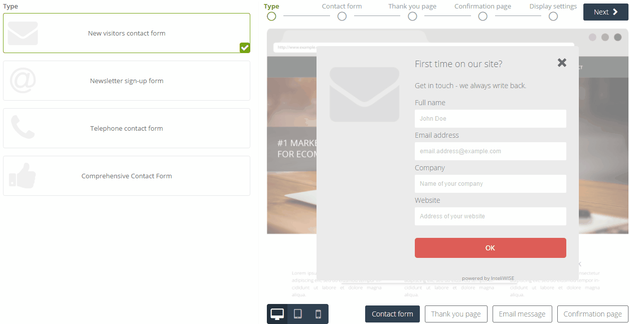
In SALESmanago, there are two ways to make a pop-up. The first one is to prepare a contact form, preferably in HTML or upload an existing HTML file. It’s a good way but it involves at least two high-class specialists – a content manager and a witty IT guy (unless you can do both yourself). This method is good and effective but it requires both time and resources. There’s a second, easier way that allows you to generate new leads within 5 minutes or less.
There’s a pop-up contact form builder we called Express PopUp designer (because it’s so fast, duh). First, select one of the four ready-to-use content templates. Each template is built around a certain goal but you can adjust all aspects of a template once it is loaded. Once it’s ready, build the form that people can use to enter their details. Pick the graphics, enter a prepared headline and text, add input fields and CTA button, et voilà. Next, proceed to design a thank you page, a short message that expresses gratitude to people who go out of their way and give you their personal information. Pick an image, add a few sentences and continue to the confirmation email. To make sure email addresses of contacts are valid and all contacts who enter your CRM database do so willingly, a double opt-in system is in place. When someone subscribes on your website, the system sends that person a confirmation email to the address provided in the contact form. Design this email with a few clicks and proceed to display settings. Specify where, when and to whom you want this contact form displayed. When you’re done, click Finish. The contact form is ready and you can activate it right away. See how it works:
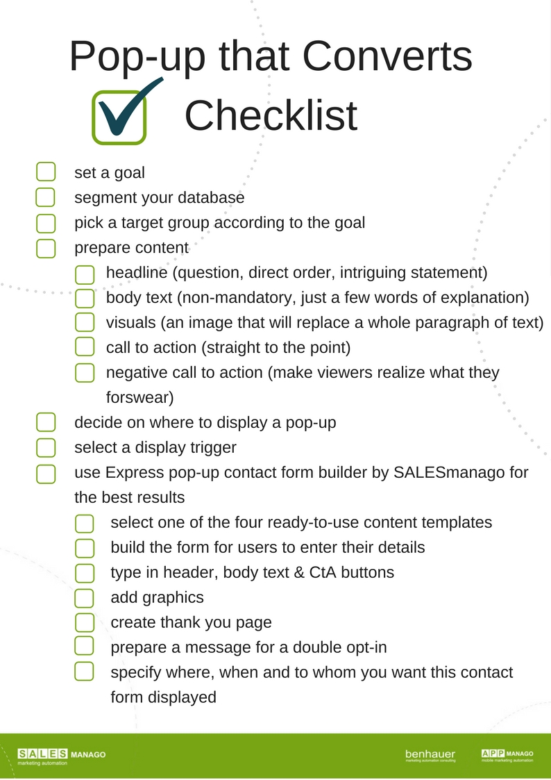
And now a summary – a downloadable checklist. Put it to good use!
 Follow