For our bodies, focusing attention requires energy input. We have to fight other stimuli that compete for our concentration. That’s why marketers create landing pages, where there are no distractions, just one specific call. In the post, we show how to develop a successful landing page from the headline to post-conversion marketing.
Create Amazing Shopping Experience. Download Free Ebook.
The purpose of a landing page
On a dedicated landing page created for a campaign we want to convince user to do one precise aim such as:
- purchase
- downloading an ebook, or a case study, or a whitepaper
- subscribing to the newsletter
- participating in the contest
- registering for a free trial.
Landing page shows one (and one only) value proposition and that’s its advantage over the home page or a product page: nothing distracts users, who are exposed to one CTA. And each element of the page should serve that one purpose.
-
Headline
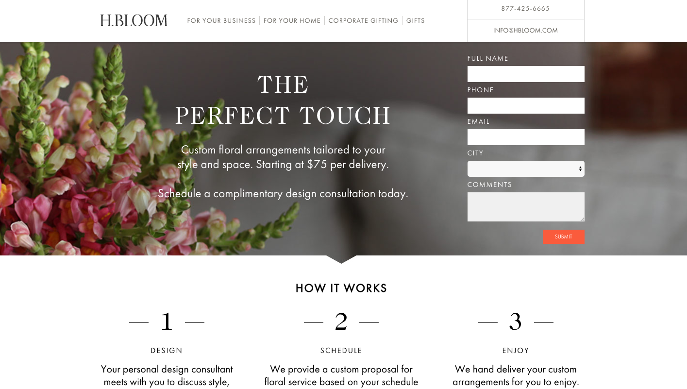
The headline should be a bold and clear statement explaining the benefits. It’s vibrant, energetic and captures attention.
See examples below:
A rule of thumb: your headline should be 35 – 50 characters long.
-
Clear, concise USPs*
On the internet, people don’t read. They scan. So be concise with the information you try to communicate. Maybe you can replace words with an image, a video or an infographic? Instead of showing abstract concepts, put images or videos of people who actually use the product, so visitors can relate to them.
Don’t be afraid of blank spaces – fewer messages equal fewer distractions. In minimalistic surroundings, your call can shine and catch the eye.
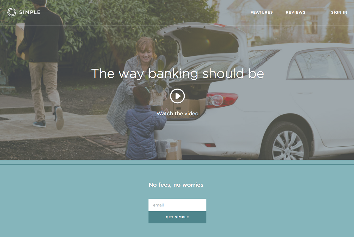
Look at Simple landing page:
With little words around, the headline and the CTA capture all your attention. Less is more!
*USPs – Unique Selling Points.
-
Talk about profit, not features
Don’t get carried away with “less is more” paradigm, though. Your LP must provide information essential to making a decision. And we don’t mean listing your products features or describing how awesome it is (we totally believe you, it’s great, but that’s not the point). You must deliver arguments for doing what you ask for. What’s in it for her?
To make sure that your arguments have a persuasive power, apply the following rules:
- Refer to possible loss: it’s more appealing than a potential gain,
- Use numbers and stats.
- Use charts and tables.
- Use Infographics. Make the knowledge as easy to consume as possible.
- Be specific and refer to user’s situation, problems and challenges.
- Use the word because – it makes your argument sound more logic and convincing.
- Give something in return: a discount, access to premium materials…
- Social proof
Social proof is a kind of an argument you can provide, but it’s so important and efficient that we decided to devote it more space.
Basically, it means showing that our product is widely used by people our customers can relate to or look up to.
How to deliver such statement?
- Quote opinions and testimonials of satisfied customers,
- Put your clients’ logotypes on the page
- Link to the review page
- Ensuring that your actual customers review your products (we write in detail about how to do it in our new ebook about ZMOT)
-
Clear CTA
Above all, make sure it’s visible. And it’s not about color (did you know that more than 50% of CTA buttons are green?), but about contrast against the background. You can also point an arrow to it. And the less surrounds it, the better.
When it comes to the copy, it should contain a verb and be specific. Don’t be afraid of a longer CTA: you can also add subtexts beneath the button. It might work better than a concise call such as “Get” or “Buy”.
-
Test
Many landing pages, especially when it comes to start-ups, look the same: they’re minimalistic, beautiful and include words such as “innovative” or its synonyms. There are many marketing fads, but you will learn what appeals to your audience only by testing, not by reading more and more reports.
So run tests. See how the amount of information or fields required in the forms influences results. Test your CTAs. Test the colors and templates.
.
The most common landing page testing mistake
Often when we check the performance of our landing pages, we take into consideration only one metric and we don’t realize that the growth at one stage is compensated with a loss on another and hurts the company in the long run.
Imagine that you created a landing page with a registration form for a free trial. You decide to test if reducing required fields will increase lead generation. You test and wow, it does! You’re so happy with more contacts!
But then you realize that in the long run these leads don’t translate into sales. They leak out of your funnel.
Maybe with a simpler form you also get less qualified leads? Because the form is so easy to fill in, people just leave their data, but aren’t motivate enough to try it for real? Although you obtain more contacts, you also increase lead leakage.
To break it down to a simple rule: The number of leads is not enough.
We don’t want to advocate either for long or short forms, but rather stress the importance of testing and monitoring many metrics, not isolating one.
-
Conversion coupling
The term means that there must be a strong bond between the source of the link and the landing page. If the ad communicates free delivery and user can’t find such information on your landing page, she might get confused. So be sure that the source message matches the landing page.
Also, match the design of your ad to the design of your LP. Why? So user knows why she is here.
-
Post-conversion marketing
Don’t forget about what happens after conversion. What message will be displayed on the website after she fills in the form? Will she see a thank you page? Will she receive a confirmation email?
Take into consideration what’s invisible to the customer, namely your rules of automation. Will the new contact be added a tag? Will she be added to a sales funnel? What kind of communication have you designed for her?
To sum up: what to remember about when creating a landing page?
If you dream of one of these successful landing pages that increase conversion by 300% and ROI by 291% (source), remember:
- The headline must explain the benefits in a strong and concise way.
- Space things out. Use numbers, bullet points, and infographics.
- Choose images or videos over words when possible.
- Don’t talk about yourself. Give reasons to buy/ subscribe/ try.
- Discuss specific situations, not abstract concepts.
- Provide social proof.
- Put 1 CTA (you can put a couple of the same CTAs, but not many CTAs).
- Be smart with testing. Check multiple metrics to make sure that an increase you see isn’t compensated by fall somewhere else.
- Landing pages don’t end at conversion. Be sure that the whole experience (including thank you page, emails or adding a contact to the funnel in the Marketing Automation platform) is smooth.
The sources
We recommend you these 3 great post on landing pages:


 Follow


