Imagine that you have an amazingly effective landing page, thanks to which you dynamically generate new leads. The statistics are soaring and sales are growing at a dizzying pace. How to create a good landing page that will attract attention?
The landing page is the place that the recipient reaches after clicking on the ad or link in the e-mail. A well-created landing page determines the effectiveness of your advertising campaign, i.e. how large the number of conversions will be. Its characteristic features are simplicity, focus, and embedding outside the main server.
The main goal of creating this type of website is the desire to generate leads, while proposing:
- e-book download
- subscription to the newsletter
- registration for events and courses
- discounts, rebate codes
- free samples
- selling the product
You already know what a landing page is, but do you know how to create a good landing page? Here are my tips.
First of all, the most important thing is what your landing page should be used for. Define the purpose of your landing page and don’t forget that it’s best if it’s only one. Putting several tasks on one landing page can cause chaos and will certainly make your work difficult, and your message will be ambiguous for the client. Why is setting a goal so important? The course enrollment will be different than the sale of the product. They will differ not only in appearance, but also in the number of forms and the type of information you are interested in. In addition, the landing page should be simple enough for the client to know exactly what it is about.
Another important thing is appearance. If you want the message to be clear and your potential customer has no doubts about which page he was on, you need consistency. Are the colors of your website blue and red? Use these colors when creating your landing page! Do you use informal language in communication with the recipient on a daily basis? Be consistent and refer to him this way also on the landing page. You will certainly do well to align your landing page with the overall message your business uses. Make sure that the form to which you direct the client is consistent with how you create the brand on your website and in social media. Here is an example of how Alior Bank handles this:
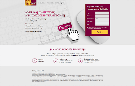
Fig. 1. Color matching of the landing page on the example of Alior Bank
The consistency of the message is very important. Not only in terms of colors, the use of logos, and communication style, but also in terms of matching to what it concerns. Your message must be clear and lucid. The landing page should continue the subject of the advertisement and even be similar to it, e.g. by adding the same graphics. The customer should have no doubts that he has found the right page.
An additional visual aspect is keeping it simple. Adding a multitude of hyperlinks may turn out to be disastrous for your campaign – they will not only blur the message but also distract the recipient from the main subject of the landing page.
At this stage, resign from:
- menu
- links “see more”
- links to social media
- linking to other subpages of the website
If you want to show more possibilities of your company, it is best to do it on the thank you page (specifically: thank you for filling in the form). You will be sure that the customer sees what you have to offer.
PROTIP: The fewer links on the subpage, the better – the chance that the recipient will click where you want is greater.
You already know what your landing page is for and how it should look visually. The next step will be to determine what elements these pages consist of. The headline is definitely an important element. Currently, Internet users cease reading the entire text, and only focus on scanning the content. They search for information that interests them. So if you want to grab your audience’s attention:
- coin a catchy headline
- remember that the text should be short (preferably up to 50 characters)
- focus on the benefits
It will be a good idea to create an appropriate graphic on which you will present the strengths of your service and adjust the photo that will complement the message (for example, show a given item in use or a memory from a previous event). Remember not to distract them unnecessarily if the text is more important on your landing page. Be sure to link every graphic you post! If you want, you can attach a short video instead of a text, in which you present the benefits of purchasing your product or enrolling in a course. It can be an animation, presentation, or demo.
According to Eye View Digital, placing a video on a landing page can increase conversion by up to 86%!
Now two important issues – form and CTA (call to action). It is important that the form is thoughtful and short. Think about what information you need and which one you want to collect. Instead of making ten data windows, it is better to create only four, but those that will be key for you. If you do not intend to use his date of birth or telephone number in your communication with the client – remove these fields. Too much data required discourages filling. A good form is one that is clear – the recipient knows what to write.
CTA is the most important thing on your landing page – it is thanks to this button, that a new lead appears in your database. It is extremely important that it is visible. How to do it?
- use contrasting colors – if your landing page is blue, don’t hesitate to use the big red or pink button. Such a practice will not let the recipient pass by your message indifferently.
- the large font that will not be omitted
- focus on the benefits – the button with the message “I want to participate” will look much better than “Subscribe”, as well as “I want to receive the newsletter” instead of “Confirm”. Don’t be afraid to get into your client’s shoes and say “yes” to the button!
A short form and clear CTA has a landing page for the Polish Driver Accounting Center:
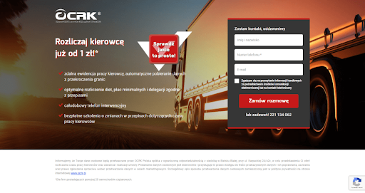
Fig. 2. An example of an OCRK landing page with a clear CTA and a short form.
You have already thought about the concept, collected all the materials, and created the perfect landing page. You made it simple and legible. What’s next? Test it! Test how your landing page works. Are the pictures or videos displayed correctly, the button redirects to the thank you page or other indicated page, and whether the form works correctly – you can enter information, and no errors appear. If the goal of your landing page is to download an ebook, check if the correct file starts downloading after clicking on the CTA. Make a test record and check if the new contact has appeared in your database.
IMPORTANT: Never share your landing page without prior testing!
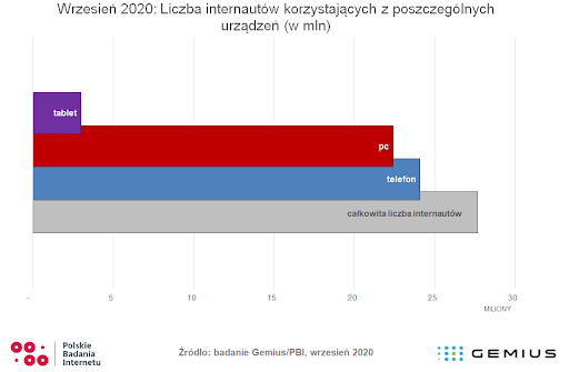
Fig. 3. Source: Polish Internet Research
The landing page has been tested, so now it’s time to think about the mobile version. According to the Polish Internet Research, in September 2020, 22.4 million Internet users used computers, while 24.4 million used mobile devices (https://pbi.org.pl/raporty/polscy-internauci-we-wrzesniu-2020/ ). Looking at the results of these studies, it can be seen that the vast majority of people browse the Internet from their phone or tablet. This means that it is worth taking a look at the mobile version of the landing page. Even more so, if you want a link on social media to send your landing page – most often users use them on mobile devices. What looks good on a computer, unfortunately, does not always look like it on a phone. Therefore, after creating your landing page, it is worth checking how it displays on mobile. Test it on different browsers and phone models to make sure that your landing page displays correctly. If not, be sure to make the necessary corrections.
An example of a good landing page:
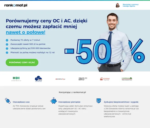
Fig. 4. An example of a landing page rankomat.pl
Pros:
- simple headline and content showing the benefits
- visible CTA
- graphics communicating the message of the offer
- clear message
- simple design
Cons:
- part of the title looks linked – just underlining without changing the color would suffice
Building the perfect landing page to make your lead conversions incredibly high is a grueling process. It requires rethinking the entire campaign, its subject, purpose, and content. It’s worth taking the time to make sure your landing page is polished from every angle. This has a real impact on whether the recipient who reaches it decides to fill out the form and buy a product or sign up for an event, and you will enjoy the next acquired customer in your database. A good landing page is the success of the entire campaign.
If you’re looking for more inspiration, take a look here.


 Follow

![[New Feature] Shine the light on your hidden visitors with Spotlight](https://blog.salesmanago.com/wp-content/uploads/2024/04/1-9.png)

![[New Feature] Unlock Deep Behavioral Personalization with Product Collections](https://blog.salesmanago.com/wp-content/uploads/2024/03/1-3.png)


![[New Feature] Shine the light on your hidden visitors with Spotlight](https://blog.salesmanago.com/wp-content/uploads/2024/04/1-9-1024x536.png)
